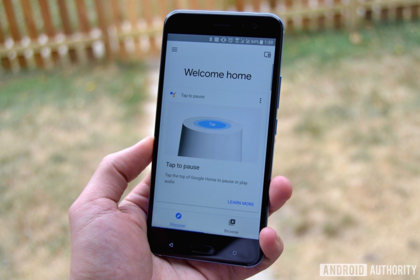
On the eve of Google’s Pixel event, the Google Home app is getting a facelift. An update is rolling out now that pushes the app version to 1.25.81.13 and brings a refreshed interface along with easier navigation. The Watch, Listen, and Discover tabs have been replaced by new Discover and Browse categories at the bottom of the screen. While the navigation might be slightly different, Google’s familiar card layout returns with some new cards in tow.
When you load the app, the Discover section will be your default destination. Discover will show you cards with tips to help you use your devices more effectively. Some of the tips I’ve seen are how to activate Assistant and how to raise and lower the volume. The tips are should shed light on how the device works to newer owners, but veteran owners probably won’t glean much from them.
----------------------------------------------------------------------------------------------------------------------------------------
Advertisment
Download some really cool apps from superhitapps to find charming people to chat & date. Hugely popular among females, some apps are offering 1 Month FREE chat for new female members.
----------------------------------------------------------------------------------------------------------------------------------------


The Browse section is a combination of the Watch and Listen sections from the old layout with some new UI tweaks. The search button has moved down to the bottom with tags for TV shows, Movies, and Music. Once you tap one of these tags, you’re taken to a new screen that focuses on that subject with even more tags at the bottom. I was able to drill down to “Adventure Action Movies that feature John Williams” before the tags reset and I was given new options. As a person who never knows what he wants to watch, it’s about a thousand times easier to find something when I can browse by a few different categories at one time.


- The new tag system is great for indecisive people like me, but if you already know what you want to watch the search button works as it always has. Once you select a movie or show, the app displays all of the sources where it’s available. You’re normally given the option to rent or buy it on Google Play Movies & TV, but results for Vudu and Netflix will pop up too if the title if available there.
Delving into the Music selection, you’ll see options from your Google Play Music or Spotify libraries. I was shown several different options for artist-related or genre radio stations, but only three options per category. That’s pretty disappointing and I feel like I’d save a lot more time by just opening up Google Play Music or Spotify and starting there. Even if you do find something interesting to listen to in the Google Home app, selecting it takes you to your music app of choice anyway, so what’s the point?
The Devices section got a small update too. All of your cast-enabled devices will be listed here and the ones currently in use will have a thumbnail shown on top of it. You’ll notice the visual upgrade once you hit the volume button in the bottom right corner. A new window will open up with a redesigned volume bar (circular instead of horizontal) and buttons at the bottom to open the app you’re casting from or stop the broadcast.


- Overall, Google has made the app a lot easier to navigate. It’s always been the hub for all of Google’s smart devices like Home,
- Chromecast, and Chromecast Audio, but now it’s easier to find media to cast to those devices.


- Night Mode comes to Google Home in the latest update if you have enabled the preview program in the Home app. You can set specific days and hours for Home to lower the volume when responding to commands. Additionally, you can also set it to dim the lights on top of the device so you’re night blinded at night if you ask for the next day’s weather.
- You can enable a Do Not Disturb mode that blocks sounds from reminders, broadcast messages, and other notifications while Night Mode is active. Alarms and timers will still broadcast while Night Mode is active so you won’t oversleep if you’re relying on your Google Home for your alarm.
Read More @ androidauthority
Contact PhoenixGMN or PhoenixInfomedia.in for all your App & Web design development needs. Other services include – SEO, Online Promotion, Digital Marketing, App Explainer Videos, eShops & much more. Checkout Our Handpicked Apps Portfolio & Videos here – https://goo.gl/DzcCWd


